about
A Tradition Reimagined
Designed with Intention
Grounded in research and guided by curiosity, the visual identity was shaped to balance reverence and refreshment — an homage to classic Japanese design, reimagined through a playful, contemporary lens. Clean lines meet bursts of sunlight. Minimalism meets character. Every detail, from packaging to palette, mirrors the philosophy behind the brew itself: a harmony of precision and delight.
In the heart of every cup of SUN coffee lies a quiet respect for Japanese craftsmanship — the patient pour, the measured rhythm, the simple joy of brewing something worth slowing down for. But SUN doesn’t just preserve tradition; it plays with it. With a wink of warmth and a splash of brightness, SUN brings the charm of Japanese coffee culture to a new generation around the world.
The Land of the Rising Sun
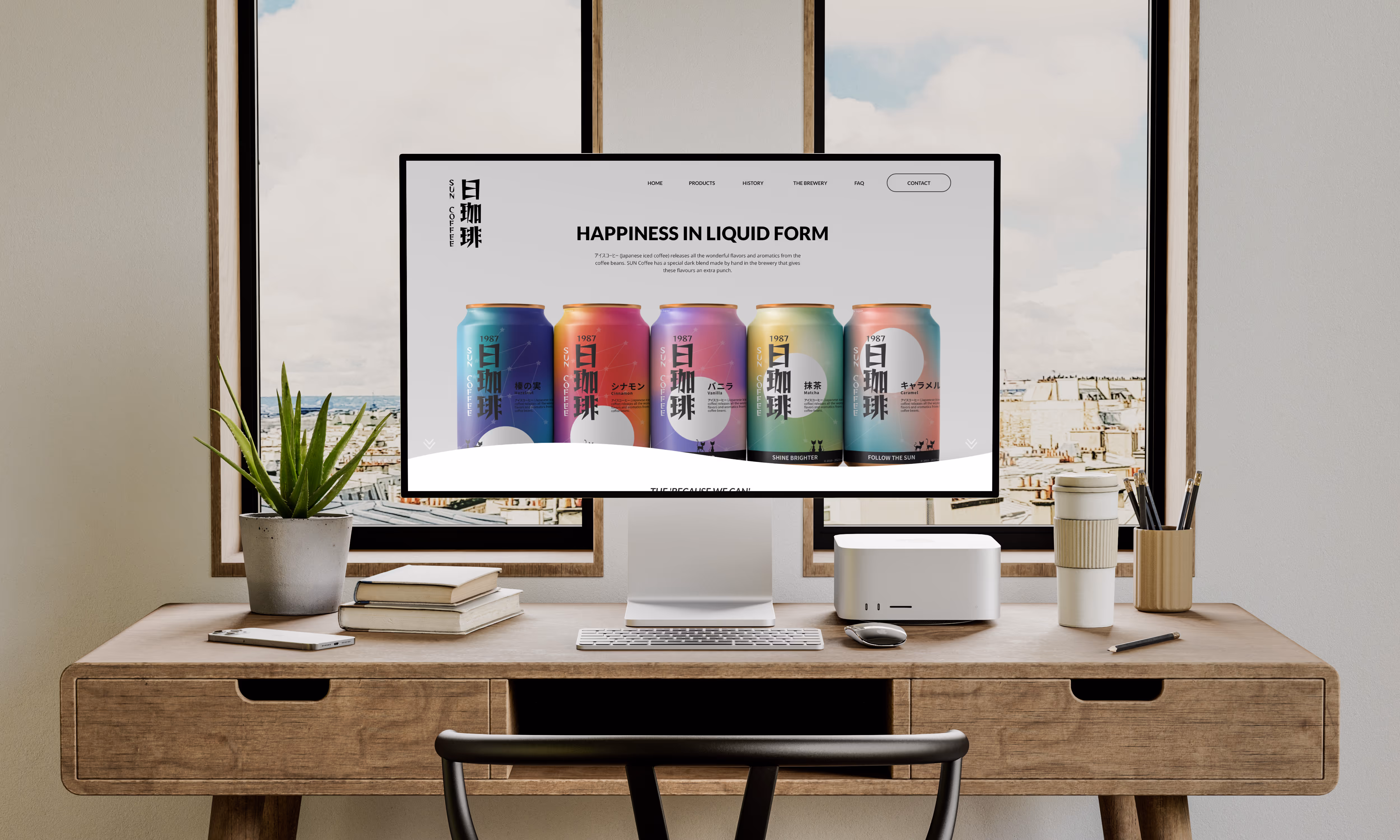
Japan — “the Land of the Rising Sun” — carries a heritage steeped in symbolism. For SUN Coffee, that idea became the heartbeat of the brand. The sun, rendered in quiet white, anchors each design while the skies around it shift in soft gradients — dawn blushes, midday blues, and twilight ambers.
This interplay of light and time mirrors the Japanese reverence for balance and rhythm. Even the logo bows to tradition: its vertical form recalls classic Japanese writing, flowing elegantly from top to bottom, right to left, while the English name sits beside it — a gentle meeting of East and West beneath one sun.
The Year of the Rabbit
The story of SUN Coffee begins in 1987 — the Year of the Rabbit. In Japanese folklore, the rabbit is a symbol of cleverness, good fortune, and the quiet pursuit of joy. To celebrate that lineage, the Kanji for “Rabbit” (兎) was reimagined as a constellation — starlit lines tracing a whimsical leap across the sky. This motif dances through the brand like a soft echo of playfulness. It’s used as a pattern, a gentle reminder of where SUN began: in a year marked by curiosity and lightness — qualities that still define the brand’s spirit today.
Black Cats for Good Luck?
In Japan, cats are not omens of misfortune but guardians of good luck — charming, watchful, quietly protective. SUN Coffee weaves this belief into its visual story: a pair of small black cats wandering across the packaging, each step tracing the gentle path of sunrise.
For Western eyes, the cats stroll left to right — a direction that reads like a narrative unfolding. Their silhouettes pop against bright skies and golden light, harmonising with the black logotype and text.
A white-and-gold wrap finishes the design with a subtle shimmer — a nod to the allure of things that gleam. Premium yet playful, the result catches both light and attention on the shelf.
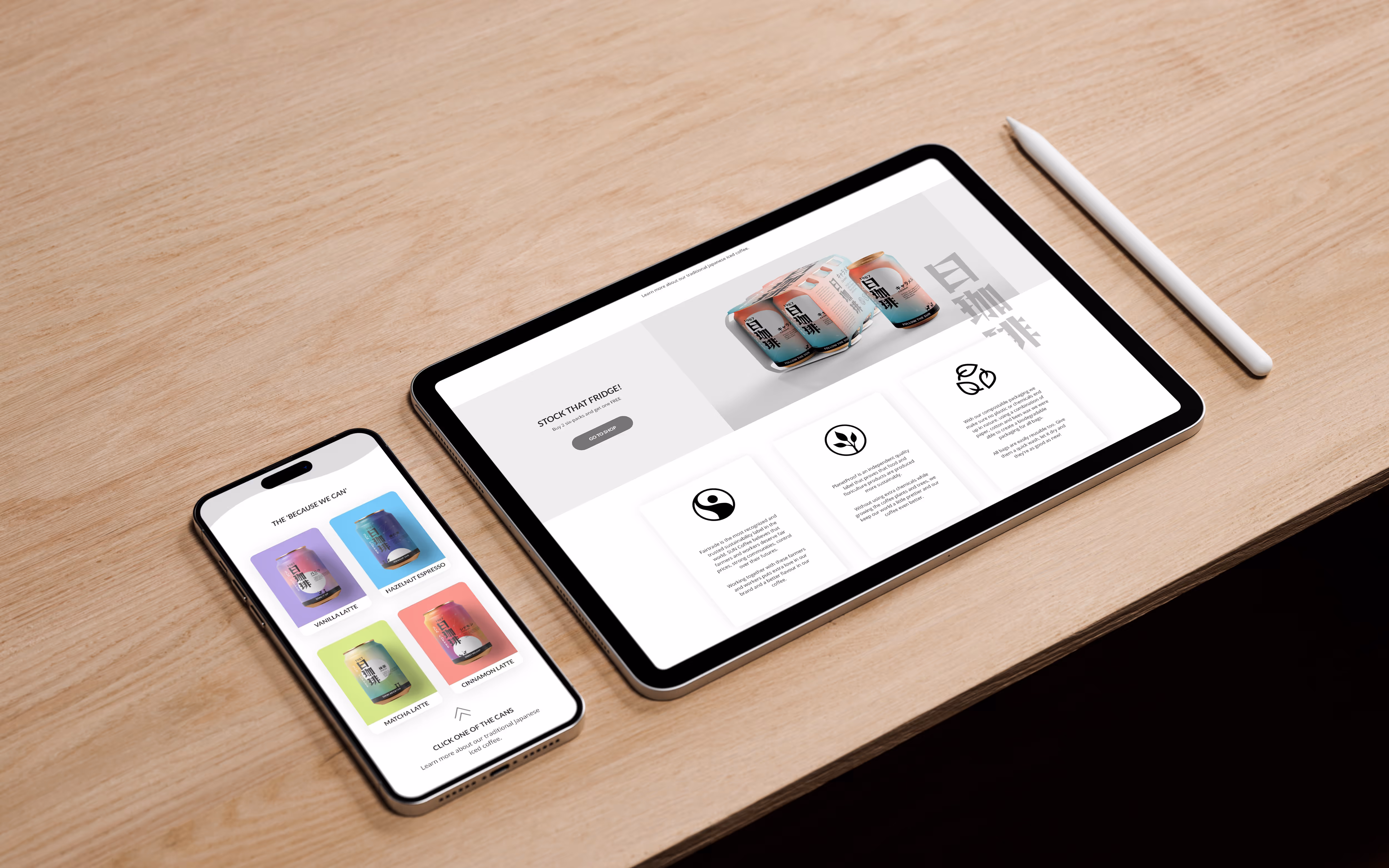
Less is More
The brand itself sings in colour, so the digital home needed to exhale in calm. The website was designed as a quiet stage — neutral, spacious, and warm — allowing the vibrancy of SUN’s identity to shine without interruption. Its purpose is not only to sell coffee but to tell a story: of heritage, craft, and the thoughtful work behind every blend. By stripping away excess, the site mirrors the philosophy at the core of SUN Coffee — clarity, intention, and the quiet confidence of something well made.