about
An Ode to the Bare Minimum
A quiet rebellion against overcomplicated skincare, where simplicity, honesty, and a little sulk take centre stage.
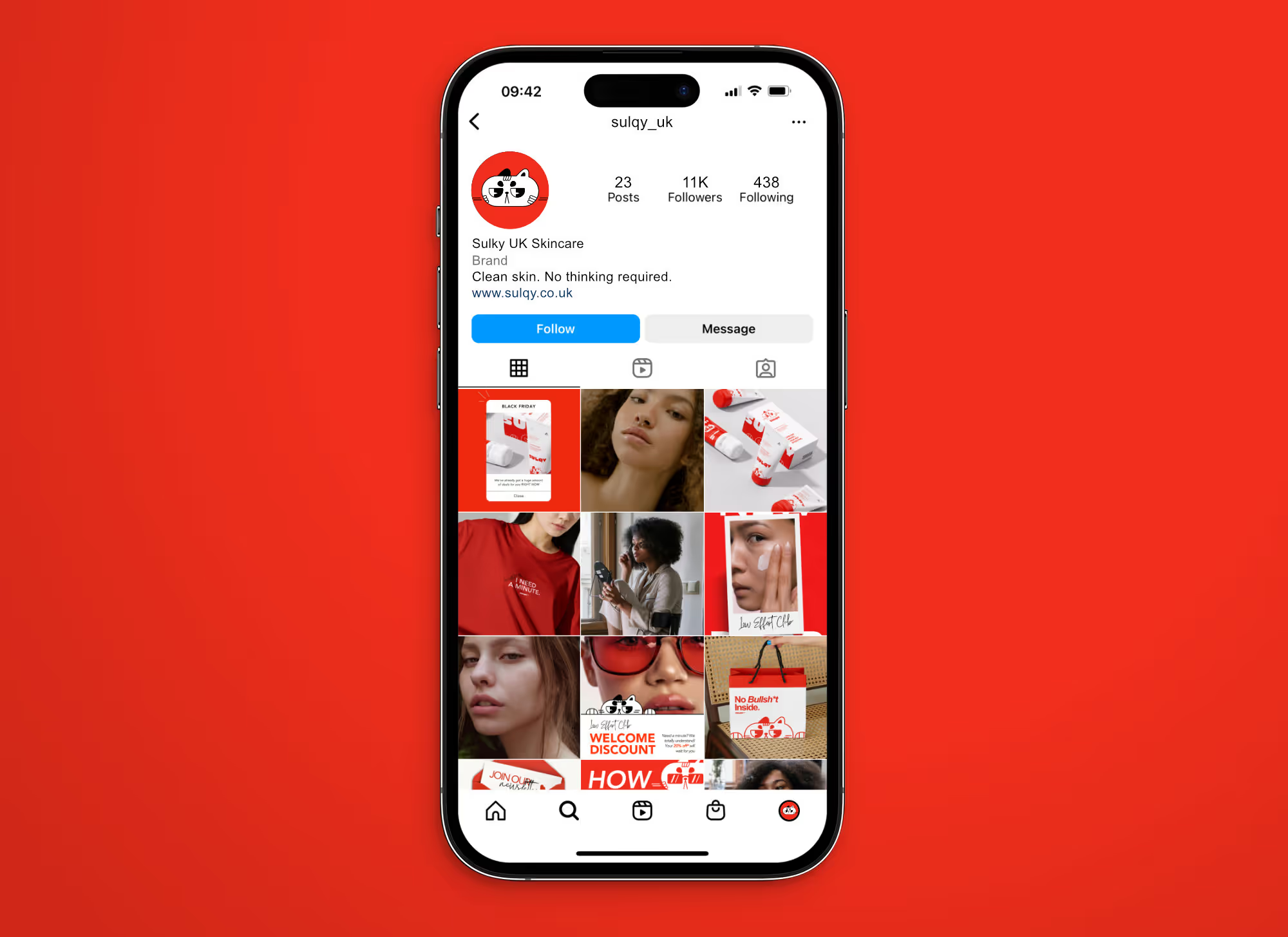
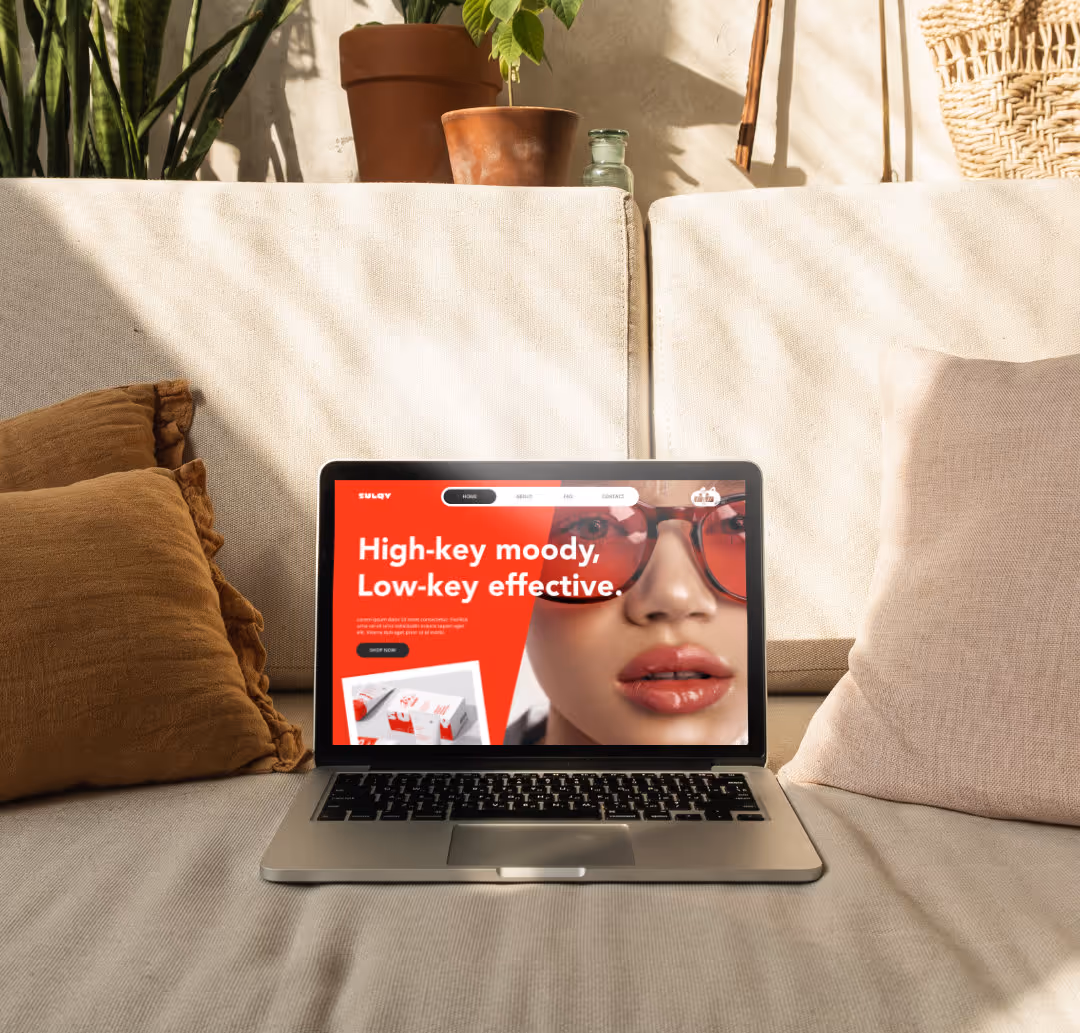
SULQY was conceived as a response to the noise of modern skincare—an industry crowded with steps, claims, and constant instruction. Drawing from the familiar emotion of being sulky, the brand embraces tiredness not as apathy, but as clarity: a refusal to overthink what should be simple.Built on a back-to-basics philosophy, SULQY offers clean, uncomplicated skincare for those who want results without rituals. Its bold red-and-white palette, blunt typography, and grumpy mascot turn frustration into confidence, creating a visual language that feels more like a mood than a routine. Across digital campaigns, everyday merchandise, and physical touchpoints, the brand presents itself as a form of relief—proof that in a culture obsessed with more, doing less can still feel intentional, considered, and undeniably cool.
Designed to sulk, built to stand out
Sulqy’s visual language is deliberately confrontational. A stark red-and-white palette creates immediate impact, drawing visual cues from warning signs and protest graphics rather than the softness traditionally associated with skincare. This contrast reinforces the brand’s core idea: a back-to-basics approach that rejects unnecessary complexity and industry noise.
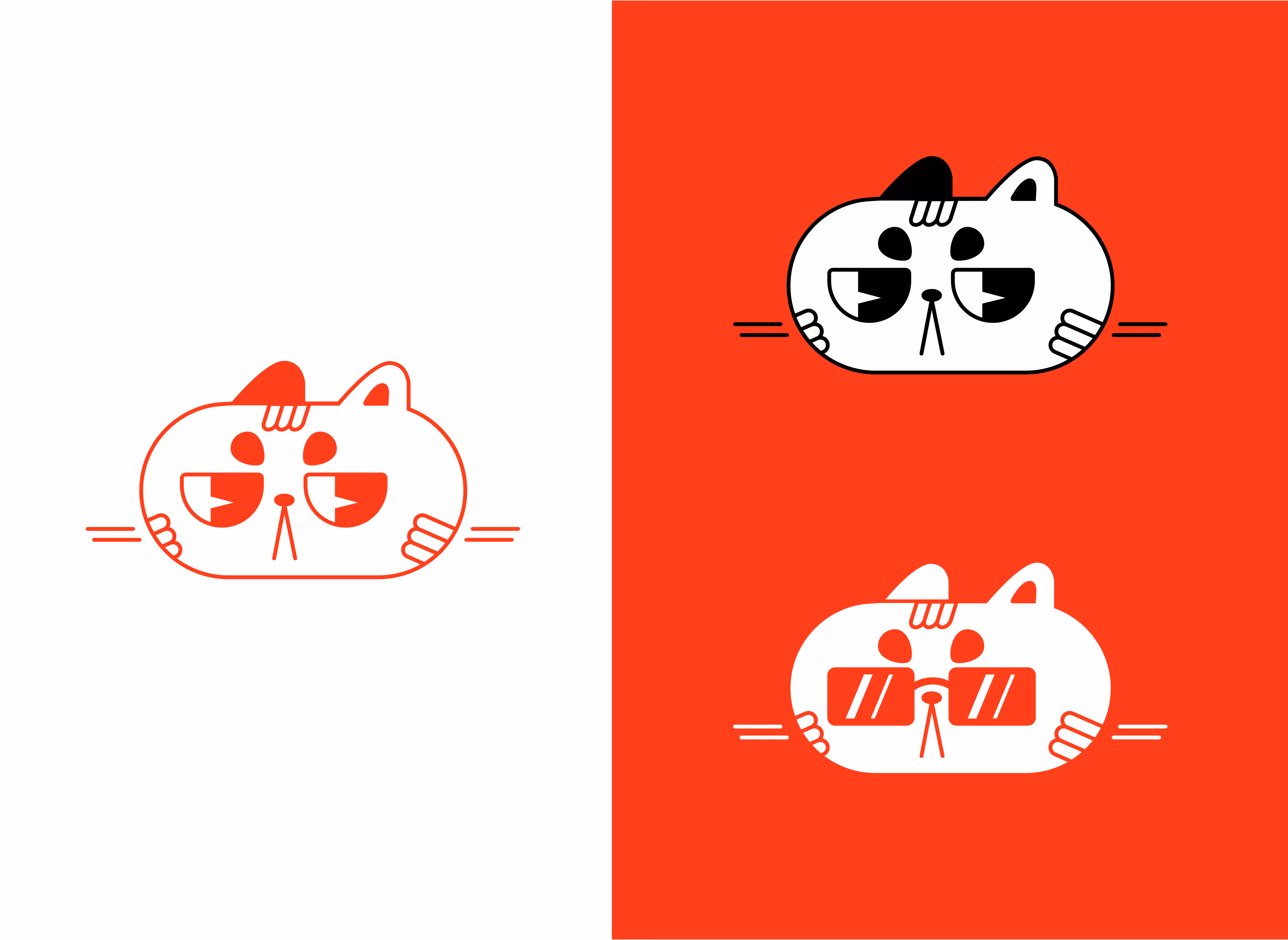
The grumpy cat serves as a bold, singular brand mark—intentionally static, instantly recognisable, and emotionally direct. Rather than shifting expressions, its consistency becomes part of the attitude: one clear mood, unapologetically repeated. Paired with bold, unfiltered typography, the identity prioritises clarity over polish and confidence over ornamentation. Together, these elements form a cohesive visual system that is striking, memorable, and built to cut through a crowded skincare landscape without losing focus.
Sulqy’s marketing language leans rough, blunt, and emotionally honest, speaking directly to an audience exhausted by overcomplicated routines and empty skincare promises. The tone embraces frustration and impatience, using humour and aggression as tools to build relatability rather than shock value.
Despite its irreverent voice, the brand remains highly strategic. Messaging is structured around simplicity, trust, and consistency, ensuring clarity is never sacrificed for attitude. Digital content is designed to be instantly legible and scroll-stopping, while PR packages and subscription boxes extend the brand beyond the screen. Limited-edition T-shirts—offered as press gifts or included with subscriptions—turn Sulqy’s attitude into something wearable, reinforcing brand loyalty and encouraging organic visibility. The result is a marketing approach that feels bold yet intentional, proving that strong personality can coexist with effectiveness and credibility.