about
Bottling a Living Landscape
Rooted in Colour & Craft
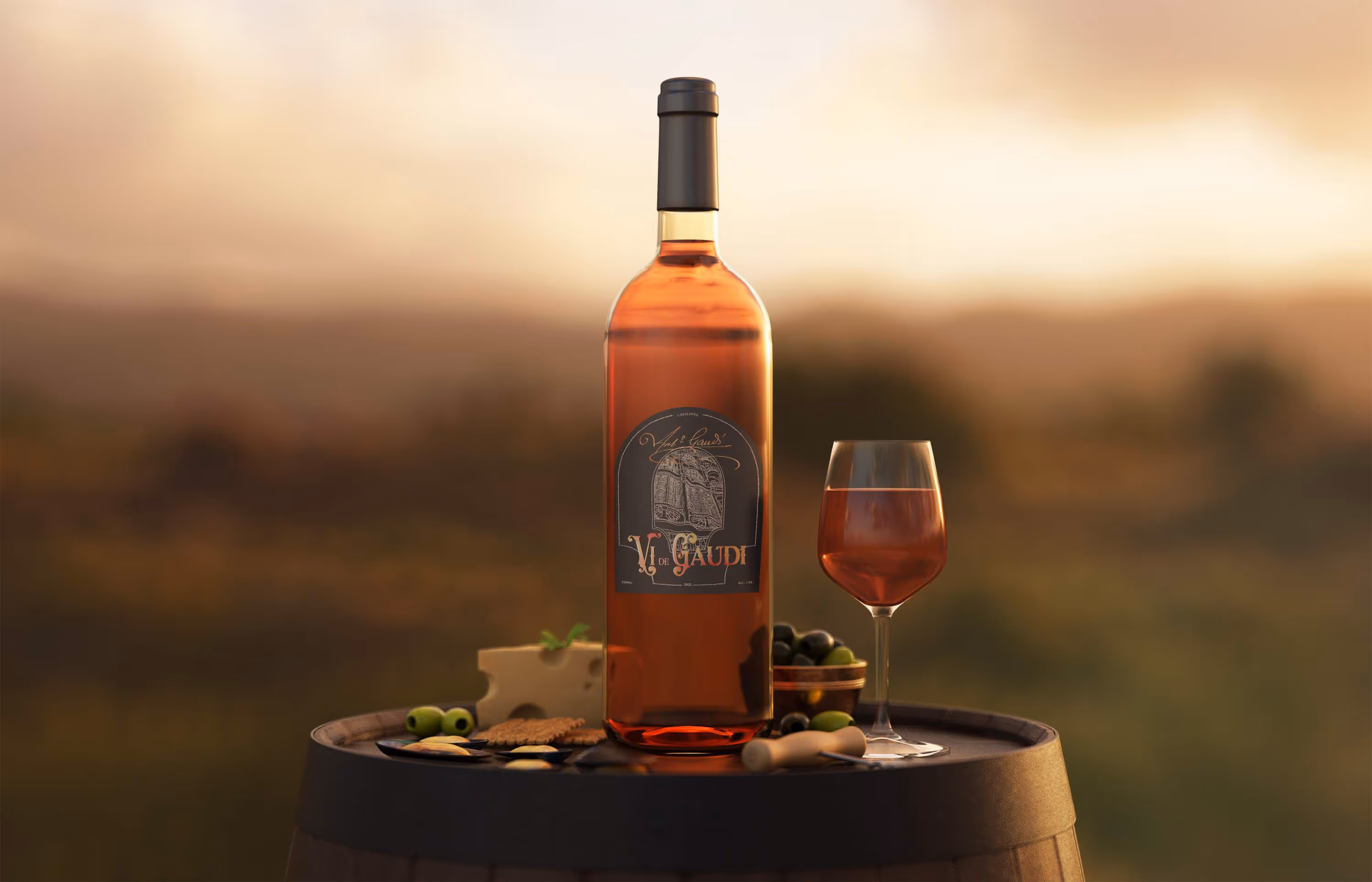
Vi de Gaudí celebrates the heritage of Catalunya through expressive yet approachable wines. Inspired by the architectural imagination of Antoni Gaudí, each bottle draws from the region’s landscapes, textures, and rhythms, translating artistry into a refined drinking experience that remains inviting and accessible.
The visual identity brings Gaudí’s playful geometry and bold colour into conversation with the warmth of Catalan wine culture. Balanced compositions and thoughtful detailing ensure the brand feels both vibrant and composed, resulting in packaging that is unmistakably artistic while retaining a sense of luxury and quiet sophistication.
Framing the Spirit of Gaudí
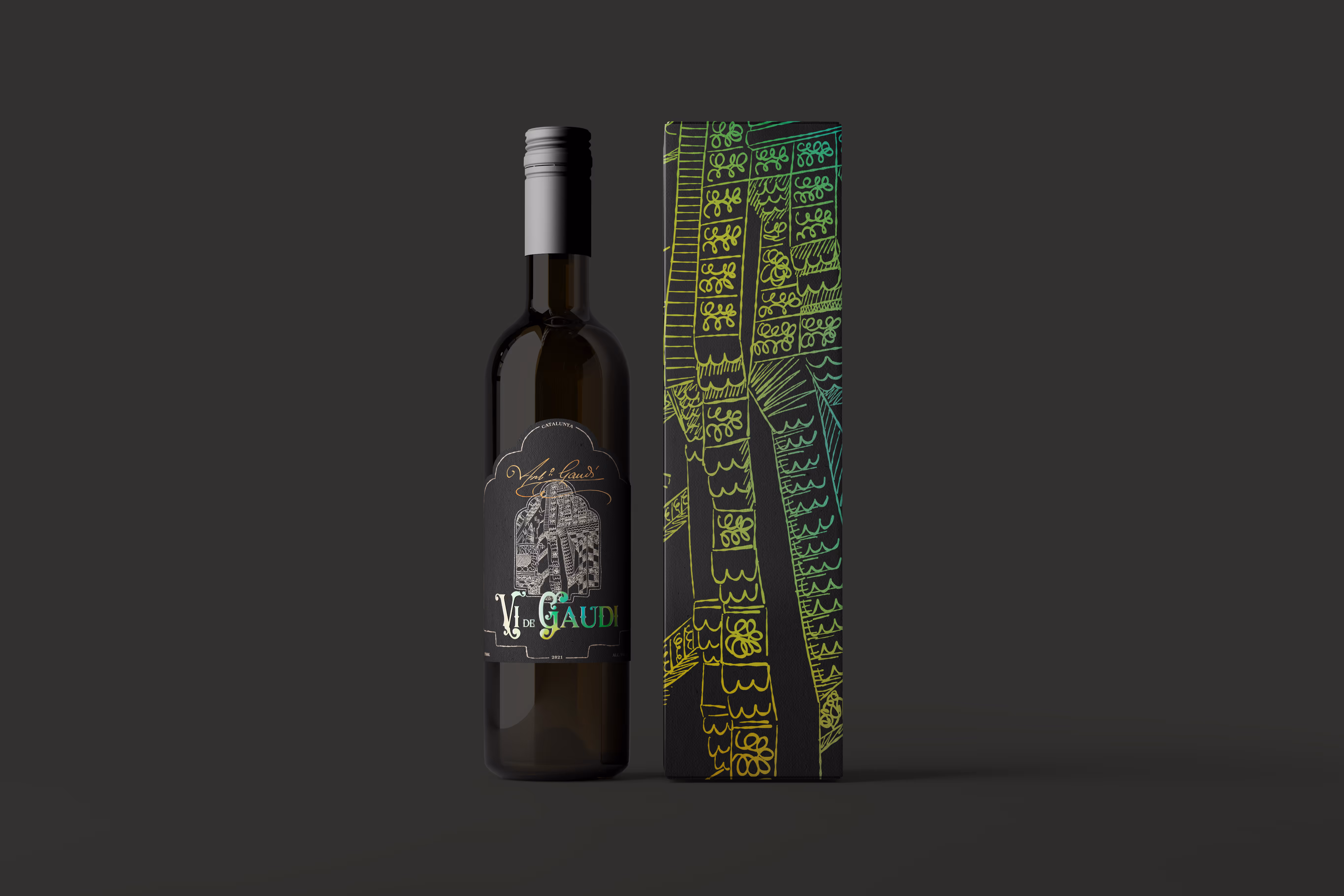
A deep, dark label forms the stage for a logo inspired by Gaudí’s iconic mosaic tiles. Set against this backdrop, vibrant gradients come to life through spot varnish, creating moments of light and movement that catch the eye on the shelf and invite a closer look. Typography balances playfulness with tradition, pairing expressive details with a bold, classic serif to bring a sense of artistry to an otherwise familiar wine format.
To echo Gaudí’s architectural language more directly, hand-drawn window-like forms were introduced across the labels. These openings offer fleeting glimpses of his buildings, suggesting discovery rather than depiction. Their loose, scribbled quality mirrors Gaudí’s affection for organic forms and surreal expression. Enlarged on the outer boxes, these sketches transform the packaging into keepsakes—objects designed not only to hold wine, but to be held onto for their character and charm.
Extending the Experience
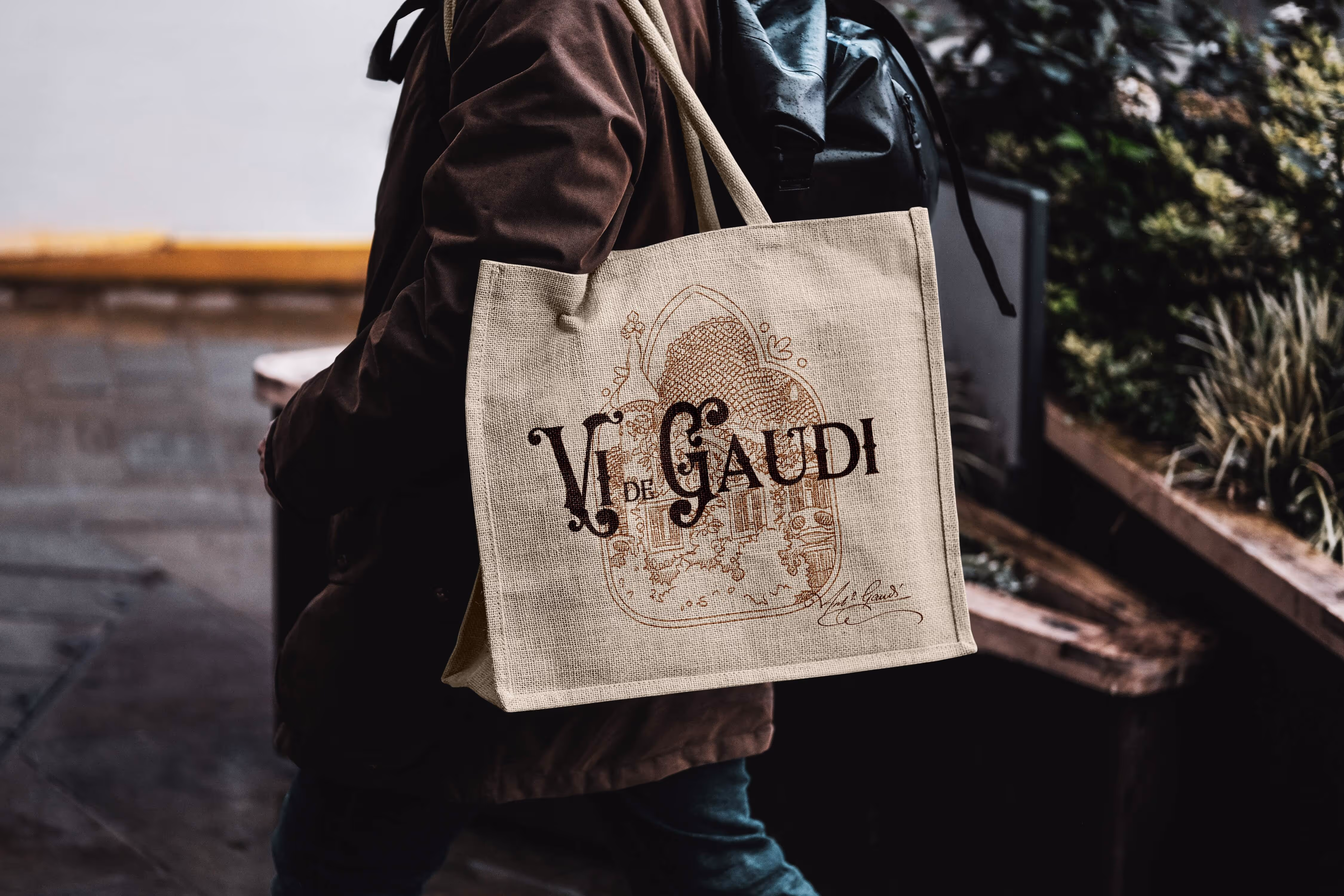
Merchandise becomes a natural extension of Vi de Gaudí’s world, carrying the brand beyond the bottle and into everyday life. Each piece is designed with the same care and intention as the wines themselves, echoing the refinement, colour, and creativity found throughout the visual identity.
Rather than functioning as simple souvenirs, these objects act as quiet keepsakes—tangible reminders of exclusive tastings and private tours. Thoughtfully crafted and rich in character, they allow guests to take a small fragment of the Vi de Gaudí experience home, long after the final glass has been poured.